
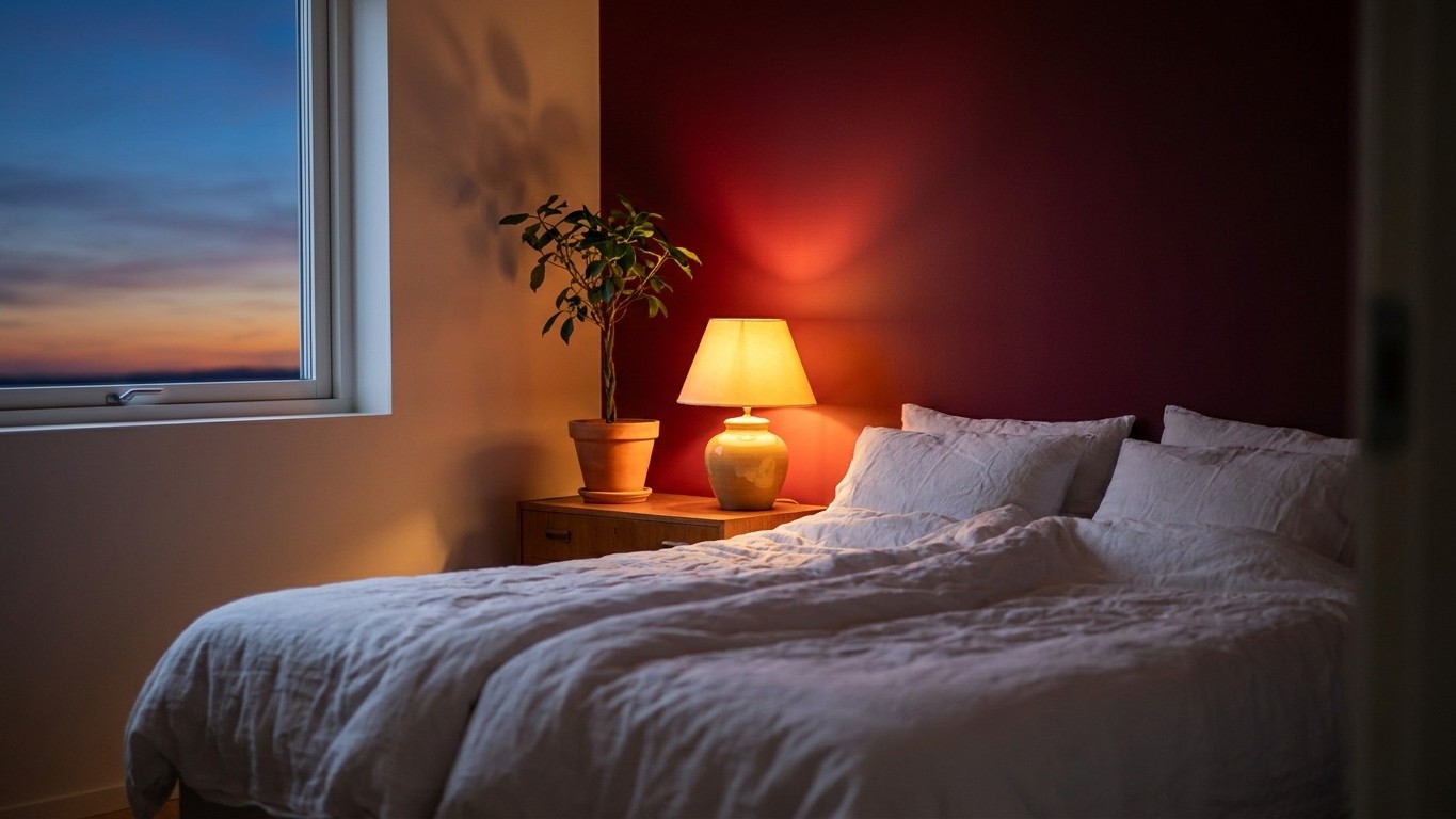
Two coats of paint, one Pinterest board, and by 11 p.m. that first night, my heart rate wouldn’t drop below “mildly anxious.” The walls I’d chosen in a deep, wine-adjacent red looked stunning under lamplight. They looked a lot less stunning at 2 a.m., when I was still staring at the ceiling wondering why my body refused to power down.
I’d fallen for the trend the way so many of us do lately. Color drenching, the technique of painting walls, trim, ceiling, and sometimes even doors in one continuous shade, has become the interior design story of the year. The 140 designers interviewed for Apartment Therapy’s 2026 State of Home Design survey confirmed that colour drenching is the year’s most significant paint trend, with Elle Decoration UK predicting it as the defining interior movement of the year. Red, specifically, had its own moment: red bedrooms were making a confident comeback in 2026, shifting from overpowering to perfectly polished. I wanted drama. I got insomnia.
Key takeaways
- A popular interior design trend turned into a personal sleep experiment with unexpected midnight consequences
- The science behind warm colors and sleep is more complicated than designers’ Pinterest boards suggest
- Small tweaks to shade, saturation, and placement can completely change how your body responds to bold bedroom color
Why red bedrooms are having a moment (and why I fell for it)
The appeal is real, and I’ll defend it to a point. When styled right, red adds warmth, drama, and personality, turning an ordinary bedroom into a space that feels expressive and design-forward. Designers I’d been following online were drenching entire rooms in a single saturated tone, layering it through carpet, walls, and fabric paneling for a cocooning, almost theatrical effect. One designer described building a bedroom scheme where “we selected a deep red scheme that threads through the space in layered ways, from the fitted geometric carpet to the fabric wall paneling.”
It photographs beautifully. It feels bold in a way that beige never will. What none of those glossy images tell you is what the color does to your nervous system once the lights go off and you’re actually trying to sleep in it.
What the color is actually doing to your body at night
Here’s the part nobody puts in the mood board caption: red isn’t a neutral background color, physiologically speaking. Color psychologist Suzy Chiazzari has been blunt about it for years, noting that “red, orange, and other hot colors raise the blood pressure, increase the heartbeat and muscle movement, so it is best to keep these to a minimum.” That tracks exactly with what I felt lying there, jaw slightly clenched, pulse a touch too present for a room that was supposed to be my wind-down zone.
The research backs up the sensation rather than just the folklore. As a warm color that conveys fear, anger, or excitement, red can be too stimulating and make a room feel smaller. A UK sleep retailer’s breakdown of bedroom color science put it plainly too: red can raise your blood pressure and pulse rate, potentially making it harder to drift off, and bright, high-contrast colours signal your brain to stay alert rather than unwind, often resulting in lighter sleep or more night-time wakings.
There’s even hard data comparing colors head-to-head. One frequently cited comparison found that blue was more helpful in prolonging sleep time, with an average sleep duration of 7.1 hours, and a 10-minute reduction in average time taken to fall asleep compared to the red group. Ten minutes doesn’t sound like much until you’re the one lying awake counting them. A separate UK hotel chain survey backed the same pattern, finding blue bedrooms outperformed every other color for promoting sleep, with red trailing well behind.
The nuance nobody mentions before you buy the paint
Here’s where I have to be honest and slightly contradict myself, because the science isn’t as tidy as “red bad, blue good.” A 2026 architectural research paper looking at circadian rhythm and interior color found something genuinely counterintuitive: unlike the suggestions of interior designers and psychologists who favor cold colors like blue for their soothing effect, warm colors like red or orange could support a healthier circadian rhythm and help occupants sleep more easily by preventing melatonin suppression at night. That’s the opposite mechanism from the “red raises your heart rate” story, and it’s a reminder that we’re really talking about two separate things, emotional stimulation versus light-spectrum physiology, that happen to point in different directions depending on which study you read.
Shade matters enormously too. A psychology researcher studying red’s effects noted that the research consistently struggles with the conflation of different red shades under one label, meaning a dusty terracotta and a saturated fire-engine red are not remotely the same experiment. My mistake, in hindsight, wasn’t choosing red. It was choosing it at full saturation, drenched across every wall with no visual relief, no matte texture to soften it, nothing for my eyes to rest on before my brain caught up.
What I’d do differently
I didn’t repaint. I compromised instead: one accent wall stayed, the rest went back to a warm, chalky off-white, and I swapped my overhead light for something dimmer and amber-toned in the evenings. The heart-racing feeling disappeared within a few nights.
If you’re still tempted by the trend, and it is genuinely gorgeous in photos, consider going terracotta or a muted brick tone rather than true red, and keep it to one wall instead of drenching the whole room. Terracotta brings warmth, charm, and a lovely Mediterranean feel to bedrooms, with earthy reds ranging from intense brick tones to softer, faded shades that instantly make a space feel more comfortable and cosy. That’s the version of the trend that let me keep the drama without the 2 a.m. ceiling-staring. The paint can wait until you’ve slept on the color first, quite literally, before committing four walls to it.
Sources : mdpi.com | livingetc.com