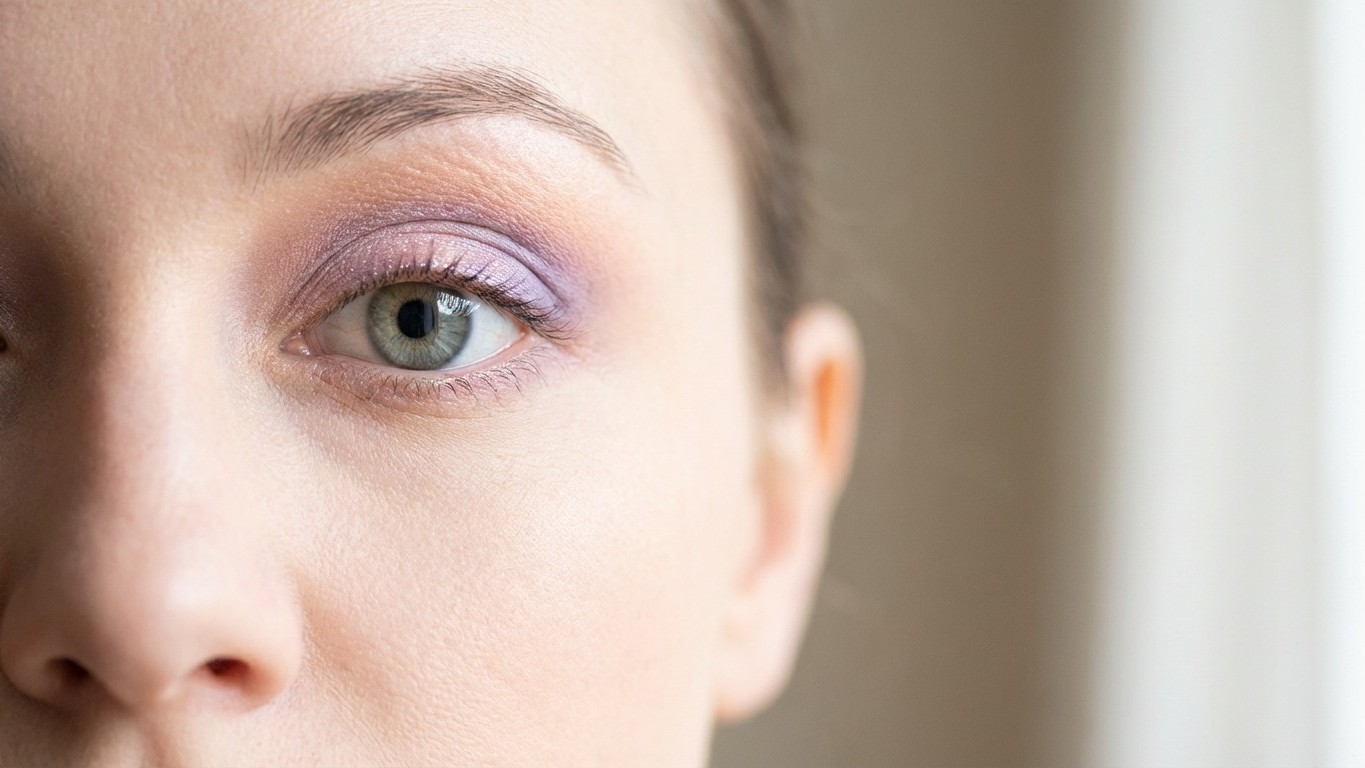
Soft lavender melting into the crease. A whisper of mint on the inner corner. That barely-there flush of peach across the lid that somehow makes your whole face look like it got eight hours of sleep. Spring pastel eye makeup is having a moment, and honestly, it deserves every bit of the attention. The challenge, though, isn’t choosing the shades. It’s making them Actually look like something instead of an accidental smudge from a highlighter you sat on.
Blending pastels is its own discipline. Anyone who’s tried to build a dreamy lilac-to-sky-blue gradient knows the frustration: the colors go chalky, the pigment disappears, or you end up with a muddy gray situation that reads less “spring awakening” and more “didn’t sleep.” The good news is that once you understand why pastels behave differently from deeper shades, the whole process clicks into place.
Key takeaways
- Why pastels behave completely differently from dark eyeshadows—and what pros know that changes everything
- The brush selection secret that separates blended-to-nothing from beautifully saturated color
- Three blending methods that make spring pastels look intentional instead of accidental
Why Pastels Demand a Different Approach
Here’s the counterintuitive part: pastels are Actually harder to blend than dark eyeshadows. Most people assume the opposite. Darker shades feel more “serious” and technical, while pastels seem forgiving and easy. But pigment concentration tells a different story. Deep shadows contain enough color to show up through multiple blending passes. Pastels, loaded with white or cream bases to achieve that soft tone, lose their color identity fast when you blend aggressively. You’re essentially blending them into nothing.
The fix starts before you touch a shadow. A white or champagne base on the lid, a simple eyeshadow primer or even a white pencil buffed out, gives pastels something to grip. Without it, the color sinks into skin and fades within hours. With it, even the most delicate mint or baby pink reads clearly and stays put.
Brush selection matters more than most tutorials admit. Fluffy blending brushes, the kind you’d use to diffuse a deep brown into the crease, are often too loose for pastels. They scatter the pigment before it has a chance to settle. A slightly more packed, dome-shaped brush gives you better color payoff on the initial placement, and then you bring in the fluffier one for the edges.
The Techniques That Actually Work
Start with placement, not blending. This sounds obvious, but the instinct is to swirl the brush around from the start, which sends everything in the wrong direction. Pat the shadow onto the lid with the packed brush, building up the color in two or three light layers. Think of it like watercolor: multiple thin washes, not one heavy coat. Then, with a clean fluffy brush, use small circular windshield-wiper motions at the edges only, leaving the center of the lid dense and saturated.
For a spring look that actually reads as intentional, the “halo” Technique works beautifully with pastels. Place a deeper shade (think dusty mauve or antique rose) at the outer and inner corners of the lid, then press a lighter pastel directly in the center. The contrast creates dimension without blending the colors into each other. A soft shimmer or pearl shade in the center amplifies this, the light-catching element makes the whole eye look larger and more awake, which feels appropriate for a season that’s supposed to feel like a reset.
Gradient blending is the other approach people love for spring, and it rewards patience. Choose two pastels that sit next to each other on the color wheel, periwinkle and lavender, for instance, or soft peach and buttery yellow. Apply the darker of the two in the outer corner and crease, the lighter on the lid and inner corner. The blending zone where they meet should be no wider than a finger. Use a clean brush with zero product on it, and work in tiny back-and-forth strokes through that meeting point only. Step back every thirty seconds. The tendency is to over-blend, which collapses the gradient into a single flat tone.
Color Combinations Worth Trying This Season
Lilac and soft gold are having a particularly strong run right now. The purple family has dominated runway beauty from Milan to New York over the past two seasons, and the pastel version of that trend translates effortlessly into everyday wear. Pair a matte lilac on the lid with the faintest smudge of warm gold in the inner corner, and you get something that reads as polished without feeling overdone.
Mint and white is trickier but rewarding. White shadow on its own tends to look stark or theatrical, but used as a blending partner for mint green, it softens the whole look into something almost aquatic. This combination photographs especially well in natural light, the kind of eye look that earns compliments outdoors, which feels very much in the spirit of the season.
Peachy coral with a touch of champagne shimmer on the lid is the option for anyone who wants the spring pastel moment without committing to something overtly colorful. It flatters a wide range of skin tones, and because it reads warm rather than cool, it pairs naturally with bronzed skin or a sun-kissed complexion.
Finishing Without Wrecking It
Setting pastel eye looks requires a light hand. A translucent setting spray, two pumps held at arm’s length, locks everything in place without disturbing the blending you just spent ten minutes on. Skip heavy setting powders over the eye area; they tend to dull pastel pigments back toward that chalky, washed-out look you’ve been trying to avoid.
Keep the rest of the face restrained. A sheer blush, a glossy or neutral lip, and clean skin let the eye do its work. The temptation to layer more color Everywhere is understandable in spring, but the looks that feel most considered are the ones that know where to stop.
Which raises the question worth sitting with as you experiment: how much of makeup’s seasonal shift is about color at all, and how much is about the texture and lightness of application, that quality of something barely-there and effortless, that pastels, when done right, manage to capture better than anything else?