For years, I was that person who admired bold print combinations from afar while sticking to safe, solid-colored outfits. Every attempt at Mixing patterns felt like a fashion disaster waiting to happen. Florals fought with stripes, polka dots battled geometric shapes, and I’d inevitably retreat to my trusty monochrome wardrobe. That Changed completely when a celebrity stylist shared one transformative rule that revolutionized how I approach print mixing.
The revelation came during a styling session where I watched her effortlessly combine what seemed like incompatible patterns. When I asked her secret, she smiled and said, “It’s all about the 60-30-10 proportion rule, but for prints.” this simple concept, borrowed from interior design, becomes a game-changer when applied to fashion.
The Golden Proportion Formula
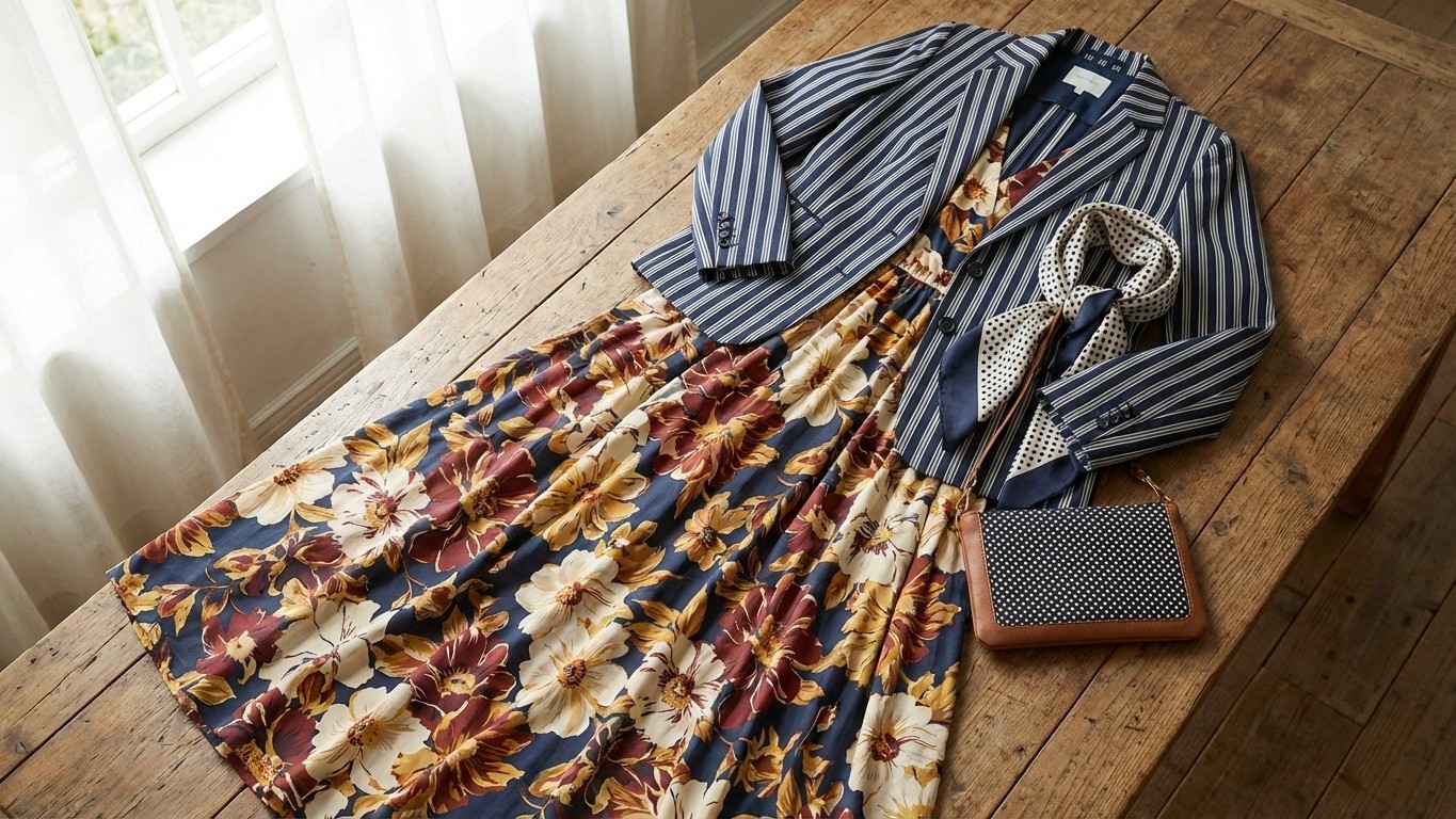
The rule breaks down like this: your dominant print should cover approximately 60% of your visible outfit, your secondary print takes up 30%, and any accent print gets the remaining 10%. This creates visual harmony instead of chaotic competition between patterns.
Think of it as creating a visual hierarchy where one print leads the conversation while others support it. When I first tried this approach with a large floral midi dress (my 60%), a thin striped blazer (30%), and polka dot accessories (10%), the combination felt intentional rather than accidental. The proportions created balance, allowing each Pattern to shine without overwhelming the others.
The beauty of this system lies in its flexibility. Your 60% doesn’t always have to be a dress or dominant piece. It could be wide-leg trousers paired with a smaller print blouse and patterned shoes. The key is maintaining those proportional relationships, ensuring one pattern takes visual precedence while others play supporting roles.
Mastering Scale and Intensity
Beyond proportion, the stylist taught me to consider scale and intensity when mixing prints. Large-scale patterns naturally draw more attention and work beautifully as your dominant 60%. Think bold florals, oversized plaids, or dramatic geometric shapes. These become your statement pieces, setting the mood for the Entire outfit.
Medium-scale prints excel in the 30% supporting role. classic stripes, medium-sized polka dots, or moderate geometric patterns complement without competing. They add interest while respecting the hierarchy you’ve established.
Small-scale prints shine as accent pieces in that Crucial 10%. Tiny florals, thin stripes, or delicate geometric patterns work beautifully in accessories, scarves, or small details like pocket squares or hair accessories. These subtle touches complete the look without disrupting the overall balance.
Color intensity plays an equally important role. High-contrast, vibrant prints command attention and naturally gravitate toward the dominant position. Softer, muted patterns work beautifully as supporting elements, allowing bolder designs to take center stage without creating visual chaos.
Practical Applications for Everyday Style
Implementing this rule Transformed My daily dressing routine. I started with simple combinations, pairing a bold Printed midi skirt with a subtle striped top and minimal patterned accessories. The 60-30-10 breakdown made decision-Making effortless, removing the guesswork from print mixing.
For Professional settings, I discovered how a printed blouse could serve as my 60% when paired with subtle pinstripe trousers (30%) and a small patterned silk scarf (10%). The combination felt polished and intentional, earning compliments from colleagues who previously saw me in solid colors only.
Weekend styling became more adventurous too. I began mixing unexpected combinations like leopard print shoes (60% visual impact despite covering less surface area), gingham shorts (30%), and a delicate floral hair accessory (10%). The proportional thinking helped me understand how visual weight differs from actual coverage area.
The rule also taught me about the power of neutral bridges. When combining particularly bold patterns, incorporating neutral elements helps create breathing room. A solid-colored belt, neutral shoes, or plain accessories can prevent pattern overload while maintaining the proportional structure.
Breaking Rules with Confidence
Once I mastered the basic proportion rule, the stylist shared an advanced technique: intentional rule-breaking. Understanding the foundation gave me confidence to experiment with unexpected combinations. Sometimes two complementary patterns work beautifully in a 50-50 split, especially when they share similar color palettes or scales.
The key insight was understanding why the rule works before departing from it. The 60-30-10 structure prevents visual chaos by creating clear hierarchy and balance. When you deliberately choose to break these proportions, you’re making an intentional style statement rather than a mixing mistake.
This simple proportion rule transformed my relationship with patterns completely. What once felt intimidating now feels like a creative playground with clear guidelines. I’ve built a wardrobe where prints play together harmoniously, creating outfits that feel both effortless and sophisticated. The confidence that comes from understanding these fundamental principles has made getting dressed genuinely enjoyable, turning my Closet into a source of daily inspiration rather than Morning stress.